How to Build Your Brand Identity With Visual Branding
Visual identification goes beyond a logo, which is only the foundational step.
Now, taking CocaCola as our example, you will observe that they use their trademark red palette in their custom packaging and advertisements. Actually, red is not always attractive on its own and works great in a scheme, but it’s certainly aggressive.
Read also: content creation agency
You find the red color plastered everywhere with the brand logo. They don’t actually ask people to buy them, but they feel their presence all over.
Building Your Brand Image
Brand visuals play a vital role in expressing your company’s narrative and representing your brand’s promise. Since there are countless ways to convey a message, you may utilize any technique that you believe will work to build a good brand identity.
It is amazing how powerful shapes and colors are for a brand. Light blue hues are generally connected with children and happy family occasions, much as bright red colors forcefully target people’s urge to acquire more.
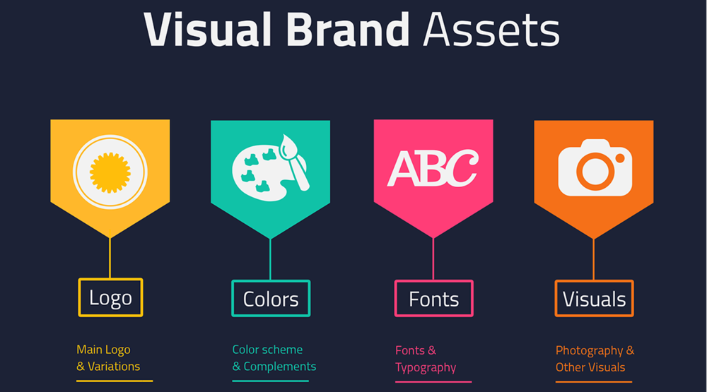
Components of Visual Branding
Marketing is generally done to drive in more profits, which is why every business seeks to impress its customers. You need to appeal to the buyer rather than yourself.
To ensure you achieve this, it is advisable to get the perspective of other people who know nothing about your brand.
There are various elements that contribute to the visual identity of a brand, but we are going to look at the most common ones. Let’s get to it.
1) Your Unique Visual Mark: Brand Logo
Your logo should be front and center on all your marketing collaterals, most especially your custom packaging. Your logo is just the starting point in the whole process of building a brand. There is a major misconception that logos must be complex for people to be interested in them.
It might shock you to realize that some of the greatest brands have some of the most basic logos but are still identifiable. The main advantage of a simple logo is that it makes it easier to accommodate changes where logo evolution comes to play.
2) Enhancing Copy: Using Images
Images are still evolving, with more complex ones emerging every day. The challenge is to remain distinctive. When you produce a picture, you are also defining its style. One approach is to do what Starbucks has done: make little alterations over time while preserving the original design and appearance.
3) Conveying the Story: Crafting Text and Choosing Text Forms
When it comes to typography, many businesses may choose something that has depth and is one-of-a-kind.
However, it would be best to strike a balance between being eye-catching and overly intricate. Marvel is one brand that should not be ignored in this category. It is extremely specific in that it has a primary typeface and an easily generated one-color backdrop.
4) Setting the Stage: Setting Up Memorable Color Palettes
After careful consideration, the color that will represent your brand is a choice you should make.
It is essential to remain consistent over time, and any abrupt changes may not yield the best results. Your images must be recognized and adaptable to resist the necessary adjustments over time.
Over to You
Building your brand identity with visual branding may seem like a daunting task, but it is a worthy task you must dedicate full focus, time, and effort on. We hope our short primer helps you get started on the right foot!